UK Cube Association

Status
Not open for further replies.
Something like this?
similar.png


I was looking more towards having something British in the logo, like the flag or an outline of the UK. Of course, it's not even going to represent me, so I really have no say in it :p

Would you be interested in something like what is in this post?

This one looks much better, much more professional, but again that's because it is taken from probably a professional company. Like I said before, I think the UK flag in the logo looks extremely tacky, but that doesn't mean they cannot be subtly added to add colour to the logo. I don't actually like that logo, being honest again. Ollie was just putting forth the idea that we need simplicity or minimalism and was showing a good example of that.
 
I agree generally with the way things are going now logo-wise. Something small and fairly simple and obviously incorporating red blue and white. theZcuber thanks for your efforts they can be considered should we need a banner for the site.
 
Yeah that's cool. Maybe face the cube right instead? (I'm sure you know what I mean :p) And colour it a little? What do people think about trying to recreate that? Or we could ask Michael/Charlie whether they have an electronic copy somewhere
 
Hey guys,

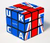
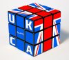
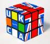
Please find below some 15 minute mock ups of what I think you are after.

Let me know if I am on the right track, which one you like better and if you have some ideas to add to it!

Hope you like.

1.
draft1.jpg

2.
draft2.jpg

3.
draft3.jpg
 

Attachments

  • draft1.jpg
    draft1.jpg
    235.8 KB · Views: 9
  • draft1.jpg
    draft1.jpg
    171.7 KB · Views: 8
  • draft2.jpg
    draft2.jpg
    172.4 KB · Views: 8
  • draft3.jpg
    draft3.jpg
    171.8 KB · Views: 10
Last edited:
15...Minutes....
O_o You have some crazy image skills.

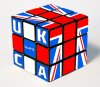
I think I prefer the first one out of those 3, could you possibly do one where the UKCA letters extend over the whole face, and maybe without the lines on that face? So that the one side just says 'UKCA'? (I think I explained that well? :/ )
 
15...Minutes....
O_o You have some crazy image skills.

I think I prefer the first one out of those 3, could you possibly do one where the UKCA letters extend over the whole face, and maybe without the lines on that face? So that the one side just says 'UKCA'? (I think I explained that well? :/ )

Haha! I think I know what you mean.. like have a plain solid face with UKCA on it? It could work.. but I think removing the cubie lines might mess up the flow a little.. I'd have to improvise a way to make it look natural and that will be difficult.. I can try if you like? But im not sure you'll like the end result lol. I think its a good idea to keep the cubies like on the UKM shirt.
 
Haha! I think I know what you mean.. like have a plain solid face with UKCA on it? It could work.. but I think removing the cubie lines might mess up the flow a little.. I'd have to improvise a way to make it look natural and that will be difficult.. I can try if you like? But im not sure you'll like the end result lol. I think its a good idea to keep the cubies like on the UKM shirt.

Yeah, I can understand how it would look weird, if you could give it a go all the same though? I think its worth exhausting all the options so we can make a good choice on a logo.
 
Yeah that's cool. Maybe face the cube right instead? (I'm sure you know what I mean :p) And colour it a little? What do people think about trying to recreate that? Or we could ask Michael/Charlie whether they have an electronic copy somewhere

I HEARD MY NAME?

This was done at my end, I'll have a hunt for an electronic copy when I get home and let you know.
 
Status
Not open for further replies.
Back
Top