Community Feedback: how can the site improve?

When clicking on an unread conversation, it naturally jumps to the latest conversion, such as:
https://www.speedsolving.com/conversations/subject.123456/page-2#convMessage-234567

Yes, and I would love to have a single link that I can bookmark and that will always go to the current point in conversation.

Why would the structure you sent server better than what is above?

It would allow me to access the content I want with one bookmark click as opposed to making three requests.

Speedsolving takes a decent amount of time to load and render. In order to navigate to the message I want I have to
-> go to speedsolving.com (wait)
-> click on the messages icon (wait)
-> click on the actual conversation link.

It may not sound like much but it gets inconvenient especially if i'm browsing on a phone where clicking the little message icon and then clicking the little conversation link are not the easiest thing to do.

I just timed myself with a cstimer and performing these 3 clicks took me 10 seconds on my phone starting from a bookmarks screen.
 
  • Like
Reactions: pTr
Yes, and I would love to have a single link that I can bookmark and that will always go to the current point in conversation.


It would allow me to access the content I want with one bookmark click as opposed to making three requests.

Speedsolving takes a decent amount of time to load and render. In order to navigate to the message I want I have to
-> go to speedsolving.com (wait)
-> click on the messages icon (wait)
-> click on the actual conversation link.

It may not sound like much but it gets inconvenient especially if i'm browsing on a phone where clicking the little message icon and then clicking the little conversation link are not the easiest thing to do.

I just timed myself with a cstimer and performing these 3 clicks took me 10 seconds on my phone starting from a bookmarks screen.
Is there a specific conversation you keep heading back to? The issue is that each new conversation would have a different link as the members in the conversation and the topic may vary.
 
  • Like
Reactions: pTr
Is there a specific conversation you keep heading back to? The issue is that each new conversation would have a different link as the members in the conversation and the topic may vary.
Yes I do and yes I realize that.
 
  • Like
Reactions: pTr
The circular avatar 'window' just doesn't work. Many avatars are designed/chosen for the original square image format.


Can you elaborate more on how it doesn't work?

My explanation was inadequate? When we had square avatars, many people will have carefully chosen their image to maximise the limitations of the 96 x 96 pixels. If it contained text, for example, the text was in as large a font size as practical, to make it readable. Putting a circular filter over said square image will chop off some of the text. If it contained a simple photo, the cropping and size would've been chosen to maximise the aesthetic appeal of the small image. Subsequent removal of 21% will butcher the image.

I don't have a dog in this fight, as I don't have a 'proper' avatar, and no doubt if a member did find the new format ruining theirs, they could change it. So it's not an important issue, but I felt it was worth you giving it some thought....
As an example, take DG Cubes avatar - see how the D and G are chopped off?
https://www.speedsolving.com/threads/community-feedback-how-can-the-site-improve.62440/#post-1196734
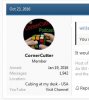
And CornerCutter - he now has: e cornercutt podcast
https://www.speedsolving.com/thread...an-the-site-improve.62440/page-2#post-1200991

Edit: Apparently the round image filter is properly called an 'Avatar wrapper'. And it would seem that a square shape, but with rounded corners of definable radius is an option.
 

Attachments

  • CCP_1.jpg
    CCP_1.jpg
    12.8 KB · Views: 7
Last edited:
  • Like
Reactions: pTr
I'd like a new dark theme: instead of black with a blue accent, perhaps a dark red accent, or even a customizable theme.

The circular avatar 'window' just doesn't work. Many avatars are designed/chosen for the original square image format.


Can you elaborate more on how it doesn't work?

My explanation was inadequate? When we had square avatars, many people will have carefully chosen their image to maximise the limitations of the 90 x 90 pixel. If it contained text, for example, the text was in as large a font size as practical, to make it readable. Putting a circular filter over said square image will chop off some of the text. If it contained a simple photo, the cropping and size would've been chosen to maximise the aesthetic appeal of the small image. Subsequent removal of 21% will butcher the image.

I don't have a dog in this fight, as I don't have a 'proper' avatar, and no doubt if a member did find the new format ruining theirs, they could change it. So it's not an important issue, but I felt it was worth you giving it some thought....
As an example, take DG Cubes avatar - see how the D and G are chopped off?
https://www.speedsolving.com/threads/community-feedback-how-can-the-site-improve.62440/#post-1196734
And CornerCutter - he now has: e cornercutt podcast
https://www.speedsolving.com/thread...an-the-site-improve.62440/page-2#post-1200991

But square doesn't look as good, circle looks much cleaner. I actually like DG's logo better with the circle. And besides, it's not like most sites do squares; even YouTube has circular profile pictures
 
Last edited by a moderator:
  • Like
Reactions: pTr
Quote:"And besides, it's not like most sites do squares; even YouTube has circular profile pictures"
Yes, that's the problem. Fashions change .... a major player changes their look, and everyone has to copy. It's not PJK's decision, I imagine, it's just how XenForo supplies it out-of-the-box.

I like the idea of the user being able to choose from circle / square / other choice / none at all. I touched on this last option in my post much earlier in this thread. I didn't want a giant question-mark as an avatar, so uploaded a neutral background-coloured 96 x 96px image as an avatar, to circumvent this.
 
  • Like
Reactions: pTr
Can I be able to show my birth year without show the month and day? For your account bio age, it could be like this: “2012, 7-8”. I’m fine with sharing my birth year, but not the
month and day.

My Proposal: A checklist that has Y/M/D and you can just check what you want shared.
 
  • Like
Reactions: pTr
Back
Top