gpt_kibutz
Regular
I did not like the red/green combination because they look similar to each other (could be due to my color blindness or my monitor though). However the yellow/blue looks really nice to me

Follow along with the video below to see how to install our site as a web app on your home screen.
Note: This feature may not be available in some browsers.


I did not like the red/green combination because they look similar to each other (could be due to my color blindness or my monitor though). However the yellow/blue looks really nice to me


 )
Yeah, I prefer the first one. I think Are you using gray instead of black to contrast white? I may prefer black actually, but I do not think that is a huge problem to people. But I may actually try this color scheme, too bad that cubesmith selection is rather small.
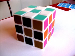
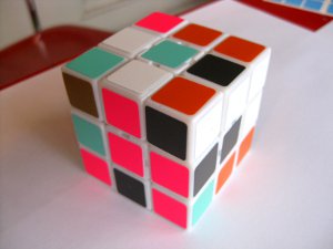
Both of these cubes use the one remaining colour range, and variance in colour intensity to achieve 6 different shades, so should (in theory) allow a colour-blind eye to differentiate between them..
@luisgepeto do either of these look any good to you?


Does this color scheme make sense? It's a (possibly) optimized variant of the Japanese one, which seems to me to be really good for non-CN solving since one side (bottom/top) is much lighter than the rest and the other is much darker.
I think having two green values makes a lot of sense, actually, since green is much more visible to our eyes than most other colors. But any two similar values on the cube ought to have one light and one dark (here red/orange and green/green).


totallyDoes this color scheme make sense? It's a (possibly) optimized variant of the Japanese one, which seems to me to be really good for non-CN solving since one side (bottom/top) is much lighter than the rest and the other is much darker.
I think having two green values makes a lot of sense, actually, since green is much more visible to our eyes than most other colors. But any two similar values on the cube ought to have one light and one dark (here red/orange and green/green).
Yellow and yellow is too similar...
Does this colour scheme make sense? It's what I use


The big problem with white is that it doesn't necessarily stick out so much. It kind of disappears more. I think this is because we are used to seeing white as a natural background colour. Just think about how many things in the world use white as the background colour.
I think without a doubt bright colours are going to stick out more. However another thing to bear in mind is that you don't want any colour to be too overwhelming. It might be very hard to find the "perfect" balance...

This idea of opposing colours may potentially work well for dealing with colour-blind cubers. I'm no expert on this, but I believe that biological theory has it that there are three light sensing capabilities in the eye. One which differentiates between green and red, one which separates blue and yellow, and a third one which determines brightness or intensity. Colour blindness I think usually involves a deficiency in ability to differentiate in one of the two colour differentiating cell types. So it is either difficult to differentiate red/green or blue/yellow. Based on this, either of these schemes may be useful to colour blind cubers:

Both of these cubes use the one remaining colour range, and variance in colour intensity to achieve 6 different shades, so should (in theory) allow a colour-blind eye to differentiate between them..
@luisgepeto do either of these look any good to you?

Here's a crazy idea, what if there existed a color eye exam for cubers. Kind of like how eye doctors test your vision with a battery of exercises, this will help you select your individualized cube color scheme. For example, it may show you a blue color tile and place a couple hues of red on either side. It would ask which of the two reddish tiles looks more similar to the blue, and eliminate that tile since it is a weaker match, i.e. less distinct.
It could also use Ishihara color tests, or the like, to find out what color combinations offer the best contrast.
The system would learn how you see color, account for any deficiencies, accommodate for aesthetic preferences, and identify where each color should go on the cube. Any grad students out there looking for a thesis topic?
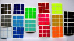
Anyway, I've stickered some cubes base on the comments here. Could someone tell me how to insert thumbnail images that can click through to full size. I've seen it done! ...if nothing else I suppose I can resize.
I tried this colour scheme on hi-games and I like it