nickvu2
Veteran
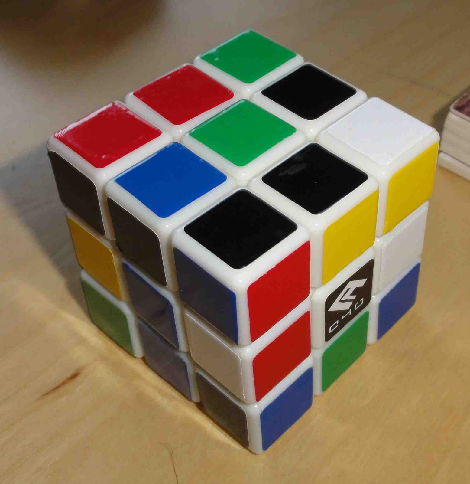
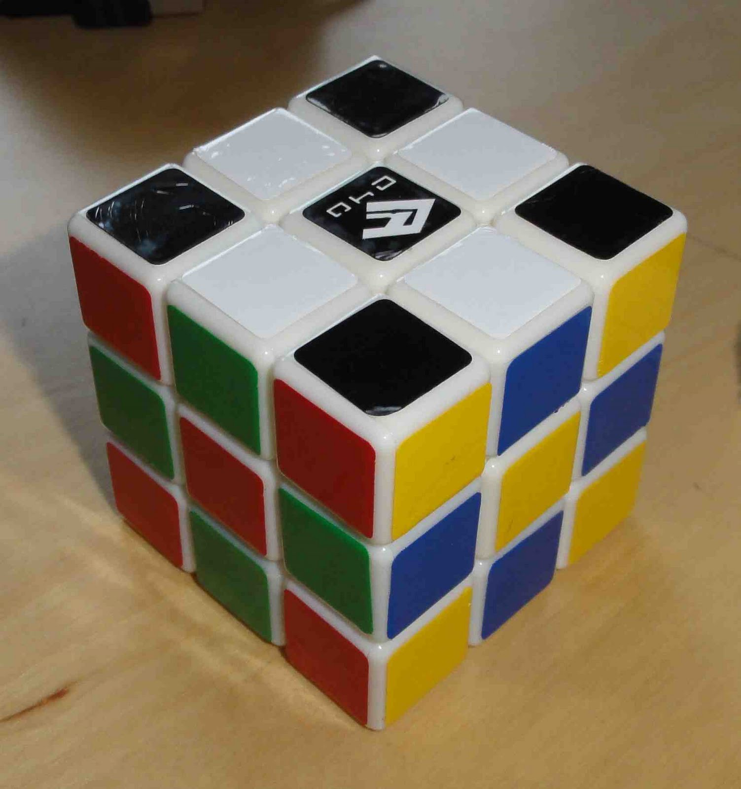
So I guess a general point for discussion is how brightness of stickers is used in recognition, and how brightness should be mixed with the colours in the scheme. Opinions?
This is a great observation/question! Before messing around with OP, I was using the half-bright color scheme. I really like the darker blue and red opposite lighter orange and green. The side colors seemed a lot more distinct than the traditional color scheme, which helped a lot with F2L. Then the bright yellow popped out for OLL recognition.
I knew there was a problem with my OP cubes when it came to OLL with black or grey on top, you you might have nailed the solution! For my style of cubing (2-side color neutral CFOP) top and bottom need to be the brightest colors. And possibly have darker/lighter shades on the sides, similar to the half-bright scheme. (Sounds like EO will have slightly different color/contrast requirements.)
I'll play around with that cube modeling script and report back.
PS: Reflectivity could be another factor, but I have difficulty with them since the appear to change brightness depending on the angle of the light source. Others may fare better though.


 I wonder if there is a better colour scheme though.