Online tool to try different color schemes

fhein

Member
Joined
Mar 9, 2013
Messages
10
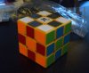
Somewhat inspired by this old thread I made a web page to give an indication of how efficient a color scheme will be in the different stages of CFOP. Maybe not so useful but it was fun writing it.

Here it is!

If you want to share or save the current scheme, just copy the url.

Possible future features:
  • Selectable cross color.
  • Cube rendering with WebGL
  • Loading common color schemes.
 
On cride5's post on that other thread, I liked the first color scheme he showed. The last ones hurt my eyes to look at. I like to not have similar colors opposite. Patterns look so much better that way. I use a white cube with black on top, red on the right, blue in front, green on the left, yellow on bottom, and florescent orange in back. When doing methods like HTA or something that orients edges first, I use orange and blue as my right/left sides and keep black/yellow on top and bottom. I also prefer tiles over stickers, but I don't know if that really effects color too much.
 
This is supposed to be halfbright+light blue.

Variation of Cride5's scheme with white+gray, yellow+red and green+blue. I think it looks interesting but I suspect it would be less useful for color neutral solvers. Might be easier to see on a white cube.
 
This is supposed to be halfbright+light blue.

Variation of Cride5's scheme with white+gray, yellow+red and green+blue. I think it looks interesting but I suspect it would be less useful for color neutral solvers. Might be easier to see on a white cube.

I expect it to be in my mailbox by Thursday morning. Thank you.

On a serious note, really cool thing to experiment with. Love it!
 
Variation of Cride5's scheme with white+gray, yellow+red and green+blue. I think it looks interesting but I suspect it would be less useful for color neutral solvers. Might be easier to see on a white cube.

Just tried this scheme with cubesmith stickers (white, dark grey, red, bright orange, blue, light green) and there are two problems for me: Bright orange overpowers all other colors and dark gray on a yellow cube doesn't pop enough for LL pattern matching. Judging by the rendered images it might be easier to see LL on a black cube. I tried solving it with red on bottom and it worked quite well, but I think I'll resticker it to regular halfbright..

attachment.php

DSC_0117.JPG
 
Last edited:
Back
Top