color scheme research

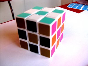
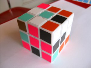
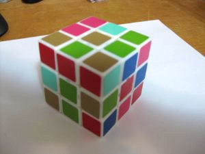
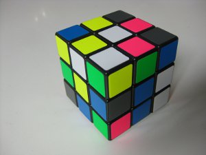
This whole thing started when I got cubes for my roommates' birthdays and let them pick out the colors that they wanted. None of them are cubers so they were just choosing fun color combinations. Here is one of the three:
IMG_1716.JPG
IMG_1718.JPG

This is aqua, white, dark grey, copper, orange and florescent pink (which for some reason looks purplish on the left). The color scheme will hence forth be known as Fall of '85; that's what Kelly named her cube :D

LOOKS BRILLIANT.

(nights)
 
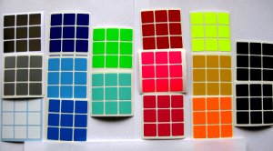
Then here is the pallet I was working with, selecting colors based on opponent process theory in combination with your suggestions.
IMG_1710.JPG

Starting from the left and going down each column we have chrome, silver, white, blue, light blue, bright blue, florescent green, agua, red, florescent pink, fuchsia, florescent yellow, yellow, bright orange, dark grey, and black.

So I have two more roomie cubes to show, as well as two experimental speed cubes. The camera has got to be around here somewhere...

I would go for:
scheme.jpg


.. but maybe a lighter grey and darker yellow (not orange though).
 
Then here is the pallet I was working with, selecting colors based on opponent process theory in combination with your suggestions.

IMG_1710.JPG

Starting from the left and going down each column we have chrome, silver, white, blue, light blue, bright blue, florescent green, agua, red, florescent pink, fuchsia, florescent yellow, yellow, bright orange, dark grey, and black.

Is it just me or the 2 last ones look the same? That yellow also looks kinda weird (probably camera messing up)
 
...there you are camera!

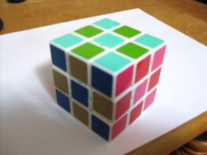
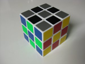
Skip's cube is known as Urban Expansion. Sorry about the shadows.
IMG_1721.JPG
IMG_1722.JPG

Aqua, light green, blue, tan, red and fuchsia.

And now for the experimental speedcubing color schemes. I'll give you my impressions, and would love to hear feedback.

IMG_1732.JPG
IMG_1728.JPG

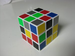
Tyco consists of black, silver, blue, florescent green, yellow and red on a white cube.

IMG_1729.JPG
IMG_1730.JPG

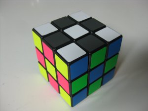
Opulent Temple consists of dark grey, white, florescent yellow, florescent pink, bright blue and florescent green on a black cube.

When selecting sticker colors, I was also considering the field color (ie cube color). For example, florescent yellow looks really nice against black but terrible against white. And blue on black seems to look darker than blue on white.

Red opposite yellow: Even though I'm still adapting to the change, I'm loving it! There is more contrast than my usual florescent orange and red. And I just really like the aesthetic.

Tyco: I'm fairly new 2-sided color neutrality, and having a hard time disassociating white from bottom. So black and silver are working very nicely since there is no definite top/bottom association with these colors. Originally, the plan was to use bright blue and fuchsia, but I already had a half-bright color scheme on the cube so decided to try out blue and red for now. The blue and black are kind of similar, but I like how opposite sides have a lighter color and darker color. It makes for a very nice balance. My only complaint is that florescent green next to yellow is ugly.

Opulent Temple: It's so beautiful; and I can only describe the charcoal next to florescent as sexy! The pictures don't do it justice. Whereas Tyco had a balance of light/dark sides, O.T. is mostly all bright. This really causes the dark grey side to all but disappear. It is all fine and dandy if you're solving grey on bottom, but it's like I'm searching for the inverse of LL patterns when solving white down. However with white on top, O.T. is superb. The side colors stand out nicely, while not overpowering the white LL pattern. I imagine it would work well for COLL. A lighter grey would likely work better for color neutrality, but still wouldn't match the brightness of the rest of the cube.

Conclusion: I like the direction that this is going. I'm more or less sold on the new color scheme, even if the exact hues and shades still need some tweaking.
 
Last edited:
Tyco consists of black, silver, blue, florescent green, yellow and red on a white cube.


Wow! Those look great. I am definitely trying Tyco out because it is closest to the colors of the Opponent Process Theory. I have a suggestion though, I think you should name Tyco "OPP" instead after the first three letters in Opponent. This will really make it catch on because we can all say "you down with OPP??"


Also, it would go with your Opulent Temple name, since the OP in that could be the first two of Opponent or the first letter of Opponent and Process.

Good stuff
 
Last edited by a moderator:
How about this? I'm having a hard time getting the orange and yellow-green right (they should be relatively bright, and distinct). This cube is based around the opponent process thing and designed for Fridrich or Roux (or really any method where two opposite colors should be distinct from the other four). The idea is that the four non-U/D colors can be formed from adding one of each set of opposite hues (red+yellow, green+yellow, red+blue, green+blue) and the other two colors should be far lighter and far darker than the rest. The U/D colors should probably be clearly distinct from each other as well as clearly distinct from everything else, more so than any other colors.

visualcube.php
 
wow, I'm just waiting for the right color scheme to be posted so I could buy it!

im thinking about Oplunet.. should I buy it?
YOUR right color scheme?

i want a cool color scheme that maybe better for me..
I'm using a black cube, and CFOP user.
my "optimal" color scheme will be very-fast recognition able and it will be very close to the regular scheme.
any suggestions?
 
Thanks to Gears, I really wanted to look at replacing yellow with black. Now I'm REALLY interested. :)
 
Then here is the pallet I was working with, selecting colors based on opponent process theory in combination with your suggestions.
IMG_1710.JPG

something is missing...

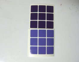
purple ):

Sorry Sarah, should have added a purple column for you :p
IMG_1736.JPG


I have a suggestion though, I think you should name Tyco "OPP" instead after the first three letters in Opponent. This will really make it catch on because we can all say "you down with OPP??"
Haha, it's been too long while since I've heard that song! Still playing around with names for the general color scheme. Tyco and Opulent Temple are more like variations on a grander theme. (And I had never named my cubes before, but was inspired by their new colorful personalities.)


wow, I'm just waiting for the right color scheme to be posted so I could buy it!

im thinking about Oplunet.. should I buy it?
YOUR right color scheme?

i want a cool color scheme that maybe better for me..
I'm using a black cube, and CFOP user.
my "optimal" color scheme will be very-fast recognition able and it will be very close to the regular scheme.
any suggestions?
Dust, you've stumbled upon us slinging around theory here. As far as I know, only two cubes have been stickered based on these ideas. So it's difficult to make any recommendation at all. Not to mention we each will have unique psychological responses to color, so you'll have to figure out your own best hues and tone. Just play around with it, either on a virtual cube or with real stickers, and let us know what you find out. You may have something valuable to contribute to this experiment!
 
Then here is the pallet I was working with, selecting colors based on opponent process theory in combination with your suggestions.

IMG_1710.JPG

Starting from the left and going down each column we have chrome, silver, white, blue, light blue, bright blue, florescent green, agua, red, florescent pink, fuchsia, florescent yellow, yellow, bright orange, dark grey, and black.

Is it just me or the 2 last ones look the same? That yellow also looks kinda weird (probably camera messing up)

Nah, the yellow is actually that odd. It's on my square-1 :p

I mean...doesn't look like my yellow (regular cubesmith yellow)
 
Of the two (Tyco and Opulent Temple) I have to say I prefer the latter. I think the brighter colours stick out much better. However the blue/dark grey colour that can be seen is a bit dodgy to me; not distinctive enough.
 
Of the two (Tyco and Opulent Temple) I have to say I prefer the latter. I think the brighter colours stick out much better. However the blue/dark grey colour that can be seen is a bit dodgy to me; not distinctive enough.

Agreed. And that's part of the reason I like the regular color scheme. All edges have distinctive color pairs. (One may complain about yellow/orange, but cubesmith orange is not that yellowish...or just get fluorescent orange)
The other part is, of course, that I'm used to it, after almost 5 years of use :D
 
Back
Top