...there you are camera!
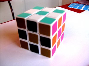
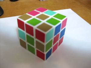
Skip's cube is known as
Urban Expansion. Sorry about the shadows.
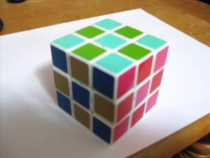
Aqua, light green, blue, tan, red and fuchsia.
And now for the experimental speedcubing color schemes. I'll give you my impressions, and would love to hear feedback.
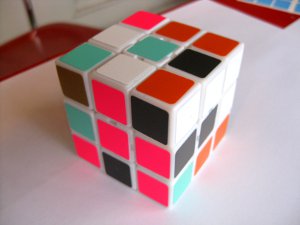
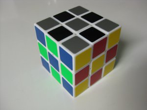
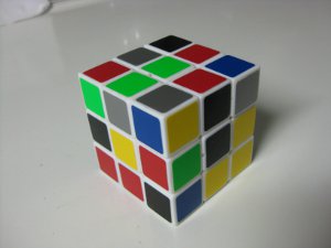
Tyco consists of black, silver, blue, florescent green, yellow and red on a white cube.
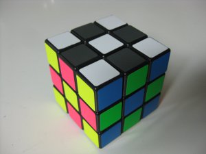
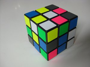
Opulent Temple consists of dark grey, white, florescent yellow, florescent pink, bright blue and florescent green on a black cube.
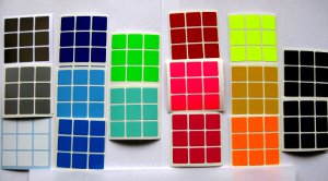
When selecting sticker colors, I was also considering the field color (ie cube color). For example, florescent yellow looks really nice against black but terrible against white. And blue on black seems to look darker than blue on white.
Red opposite yellow: Even though I'm still adapting to the change, I'm loving it! There is more contrast than my usual florescent orange and red. And I just really like the aesthetic.
Tyco: I'm fairly new 2-sided color neutrality, and having a hard time disassociating white from bottom. So black and silver are working very nicely since there is no definite top/bottom association with these colors. Originally, the plan was to use bright blue and fuchsia, but I already had a half-bright color scheme on the cube so decided to try out blue and red for now. The blue and black are kind of similar, but I like how opposite sides have a lighter color and darker color. It makes for a very nice balance. My only complaint is that florescent green next to yellow is ugly.
Opulent Temple: It's so beautiful; and I can only describe the charcoal next to florescent as sexy! The pictures don't do it justice. Whereas Tyco had a balance of light/dark sides, O.T. is mostly all bright. This really causes the dark grey side to all but disappear. It is all fine and dandy if you're solving grey on bottom, but it's like I'm searching for the inverse of LL patterns when solving white down. However with white on top, O.T. is superb. The side colors stand out nicely, while not overpowering the white LL pattern. I imagine it would work well for COLL. A lighter grey would likely work better for color neutrality, but still wouldn't match the brightness of the rest of the cube.
Conclusion: I like the direction that this is going. I'm more or less sold on the new color scheme, even if the exact hues and shades still need some tweaking.