Sakarie
Veteran
Do it have to be "Speedsolving the Rubik's Cube and Other Puzzles? I don't like when non-names (and other stuffs that should be capitalized) have capital letters. Also, it's not correct, I think?

Follow along with the video below to see how to install our site as a web app on your home screen.
Note: This feature may not be available in some browsers.


preview

 I think it'll be cool


THIS IS A WORK IN PROGRESS. Let me know how you like it.



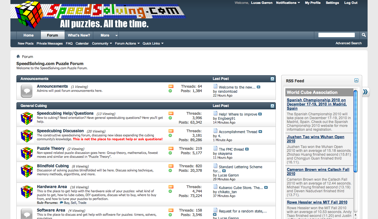
So, while I don't think the new design is bad, I think the lack of antialiasing on the grid is terrible (and the full orthographic perspective of the cube is a bit odd).


I also agree, it looks much better with antialiasing. Lucas, can you please email me the file with the slogan on it? pjkcards [*-at-*] gmail . Many thanks.So, while I don't think the new design is bad, I think the lack of antialiasing on the grid is terrible (and the full orthographic perspective of the cube is a bit odd).
I offer this version of it:
EDIT: Or could we at least use something more like this?
Did you get my email? In case not:I also agree, it looks much better with antialiasing. Lucas, can you please email me the file with the slogan on it? pjkcards [*-at-*] gmail . Many thanks.


Not much different. Done in 3DS Max....
Not much different. Done in 3DS Max....
I did get your email, but haven't had the chance to mess with it. Can you add the slogan to the banner? Thanks.Did you get my email? In case not:
Same size as current one: http://archive.garron.us/img/2010/speedsolving_logo_lg_96_.png
10x:
http://archive.garron.us/img/2010/speedsolving_logo_lg_960.png
It's in there, just blends into a white background. ;-)I did get your email, but haven't had the chance to mess with it. Can you add the slogan to the banner? Thanks.
