color scheme research

So I guess a general point for discussion is how brightness of stickers is used in recognition, and how brightness should be mixed with the colours in the scheme. Opinions?

This is a great observation/question! Before messing around with OP, I was using the half-bright color scheme. I really like the darker blue and red opposite lighter orange and green. The side colors seemed a lot more distinct than the traditional color scheme, which helped a lot with F2L. Then the bright yellow popped out for OLL recognition.

I knew there was a problem with my OP cubes when it came to OLL with black or grey on top, you you might have nailed the solution! For my style of cubing (2-side color neutral CFOP) top and bottom need to be the brightest colors. And possibly have darker/lighter shades on the sides, similar to the half-bright scheme. (Sounds like EO will have slightly different color/contrast requirements.)

I'll play around with that cube modeling script and report back.

PS: Reflectivity could be another factor, but I have difficulty with them since the appear to change brightness depending on the angle of the light source. Others may fare better though.
 
Ooh, after some more playing around, I think I've settled on what I'm putting on my next cube:

visualcube.php


visualcube.php


It taps into basically the same scheme as the original, just with alterations to the hue. My only real worry is that the grey might get lost, but I could try a lighter shade, I guess.

White = Gray
Yellow = Gold
Orange = Fuschia
Red = Purple
Blue = Light Blue
Green = Green

I'm not sure how good it would be for speedsolving, but that scheme looks really awesome!
 
Cride, if you were to make any changes to that colour scheme of yours, what would they be?

I like the colour scheme very much, and am considering buying some stickers of those colours. Just don't want to waste any money.
 
Cride, if you were to make any changes to that colour scheme of yours, what would they be?

I like the colour scheme very much, and am considering buying some stickers of those colours. Just don't want to waste any money.

I think if I was a colour neutral CFOP user I would probably use that exact scheme, because it keeps the 'similar' association of opposite colours the same, while maximising contrast between them.

As a ZZ user though, I think its better to have darker stickers on F, B, R and L, with lighter stickers for U and D, so I would probably go for something like the standard scheme, but with a lighter yellow, and possibly darker blue/greens and a mid-range red/orange. Cubesmith don't really do a 'dark' green, or a lighter red though. The standard scheme on my CII is pretty good though. The only thing I would change on it is to maybe make the yellow a bit lighter.

It was an interesting point which nickvu2 brought up about reflectivity. Standard vinyl stickers are fairly reflective, which means their brightness is likely to vary quite a bit in different lighting conditions. I was using a standard textured set of stickers on my main type-C1.5 speedcube for a while and it was pretty good, so it might be worth experimenting with them.
 
So, no colour scheme switch then? I'm switching to ZZ, which is bad timing. :P I wonder if there is a better colour scheme though.

Not for the moment, but I will keep an eye out for better sticker sets, possibly with darker blues/greens and a brighter red which maintains good contrast with orange. This would work well for EO because its really the red/orange and white/yellow that I'm interested in, while blue/green is still used in detection it is better if it blends into the background as a 'non-colour'. Similarly, during F2L lookahead, there as a lot of scanning of the L and R sides for red and orange, as it often determines which F2L edges you're looking at.

Anyway, have fun with ZZ ... and do persevere with the EOLine ;)
 
Bumping because I feel like it

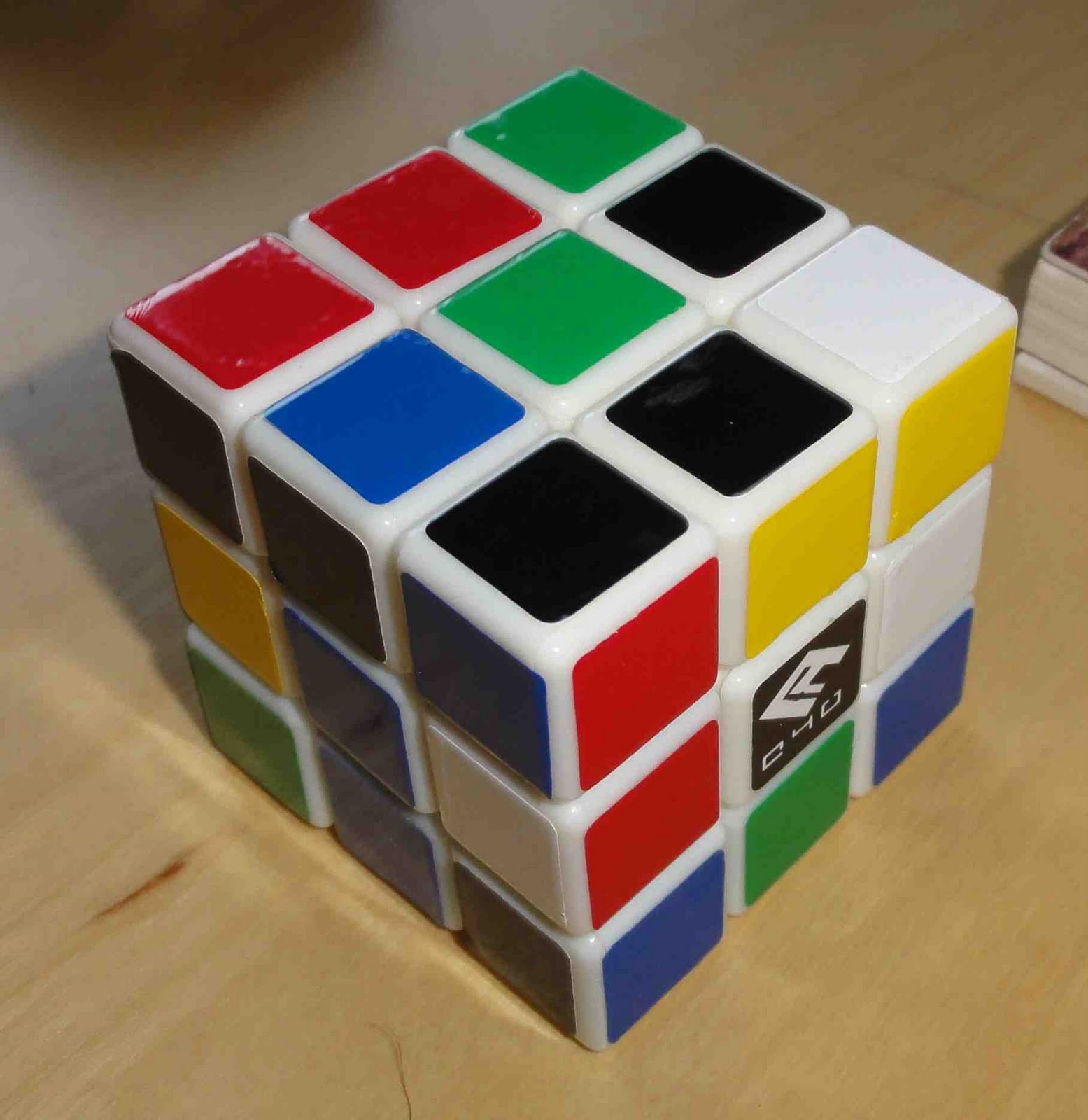
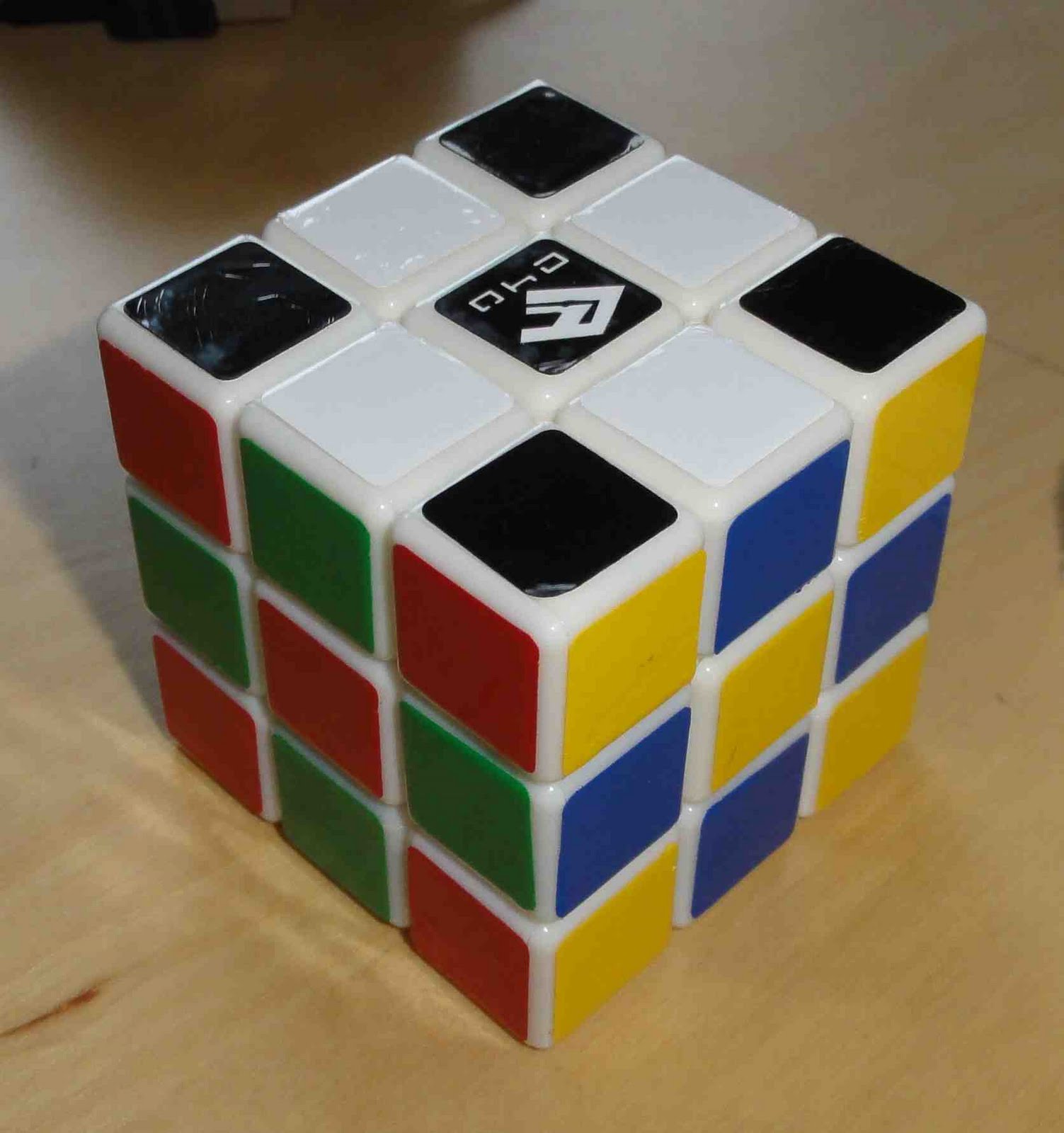
I've been playing around with the opponent colors and I think I can post some results. I decided to be a purist and go with black and white on one cube, but that meant the cube had to be white (I'm used to white on white but no black on black). I set up a FI a week ago and have been toying around with it. Even at the very beginning, recognition was amazing. Red and green, blue and yellow, and white and black contrast very well with each other. I think the secret is the dark/light contrast, not just the colors.

Images below. Had to spoil because my camera's resolution is too &#$%ing high.
OppoColors2.jpg

OppoColors.jpg
Light v. Dark works well. A lighter yellow and a darker blue (and a lighter green and a darker red) might help with recognition even more. Right now I have it set up so that blue and green could be mistaken for each other.

Another plus to the scheme is that now I am color neutral (well, on this cube). I could always solve white/yellow, but now yellow is not opposite to white. I started off just black/white, blue/yellow. After a while I decided I would just go for it and learn red/green. Maybe the most surprising thing about this color scheme is the speed at which it's catching up to the standard: I average sub-20 on regular and 24-25 on this.


So opponent colors really do work. The big question: should opponent colors be adjacent to each other? For example, you have white/black on U/D. On R you have a really dark green. On L you have a really light green, thus taking into effect your eye's natural darkness sensor. On F you have a really dark red and on B you have a really light red. All faces are clearly distinguishable from their opposites because of the darkness, and they are easily distinguishable from their adjacent faces because they are opponent colors.
 
After toying around a bit here's something I have come up with and am thinking about using

visualcube.php


visualcube.php


any thoughts?
 
I just bought about 20 bucks in stickers from cube smith. Totally going to try out that opulent color scheme posted a few pages back.
 
@eastamazonantidote: Why have I not considered using a white cube!? I was having the same problem with black on black, but I have no problem with white on white. Hopefully I can do some stickering tomorrow and try it out.

My latest OP (opponent process) trial used cubesmith's half bright set. I really liked the contrast in brightness. But the big problem was trying to find an alternative to black stickers on my black cube, so I haven't been using it.

Earlier Cride suggested blue opposite green and red opposite yellow. His explanation was something like, blue/green are similar and red/yellow are similar so we would recognize these pairs as more distinct if they are opposite as opposed to adjacent. Not to mention that it's closer to the traditional color scheme. But it sounds like your setup is working well for you. Do you have any thoughts on this? It would be interesting to play with the placement of light/dark colors as well; adjacent darks vs. opposite darks.


@Mewrius: I like to squint at the cube and see if any colors blend together (difficult to distinguish). My goal is to have as little blending as possible. For me, your grey and purple look similar, as well as orange and yellow. I personally have less of a problem with blue and aqua base on my squinty test X)
 
Back
Top