

Snigel
Regular
- Joined
- Jun 20, 2010
- Messages
- 122
This thread is probably on-topic, but as I'm not sure in which forum it fits, I'll post it here to be safe. This is about cubes, but not speedcubing as such. I found this quite interesting and thought some of you might as well!
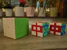
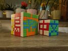
Last year, I set myself a small challenge that became more interesting than I expected. I wanted to write 揭密中文 (the Chinese title of my website Hacking Chinese) on the faces of big cubes. Not a mosaic with dozens of cubes; that would be neither interesting nor fun. One character per face.
That turned into an experiment in how Chinese characters carry information and how little of that information you actually need to read them. My goal was to write the four characters using cubes as small as possible while also making sure the text is clearly legible. But how big do the cubes need to be? YuXin sells a mass-produced 16×16, but I'm not too keen on paying $1,000 for two of them and spending dozens of hours on centre commutators.
Is 16×16 even enough to write Chinese characters? Is a lower resolution possible? What about 12×12? Or even 8×8? How small can Chinese characters be while still being legible?
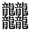
Reading is much more complex than most people think. Sometimes you probably need more than 16×16 to write a character clearly, sometimes you need 2×1 pixels. 一 ("one") is pretty simple, but 𪚥 (four 龍, a super rare character meaning "the appearance of a dragon flying") needs something like 22×22 to even display all strokes.
Yet we do not read characters in isolation, so reading each stroke is neither practical nor desirable, just like in English we don't read every line in every letter and can indeed skip whole words and still understand what a sentence means.Context does much of the work. If a proficient reader sees 打喷… they will probably supply 嚏 without seeing it, forming the phrase 打喷嚏 "to sneeze". There is no other character that fits there. That matters when the grid gets tiny, as readers can interpolate and guess.
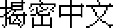
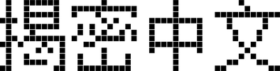
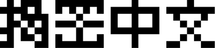
Fortunately, I'm not the only one who has thought about this, so I looked at pixel fonts for Chinese. 16×16 is very safe for ordinary text. 12×12 is still fine for a proficient reader. 8×8 sits on the edge, where context rescues the hard cases. For my goal, 中文 even squeezes into 5×5 if you are careful. 揭密 needs proper design, however.
Then the cube itself has its own constraints and idiosyncrasies. A 10×10 is not a neat 10×10 pixel grid because edge and corner pieces are larger rectangles and squares, so strokes bulge at the borders unless you plan for it. Using the corners can look really weird in some cases.
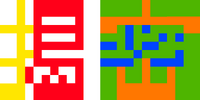
The small breakthrough for me was to stop thinking in black and white. A cube gives you at least three colours to work with, even though you could technically use more, but it would then get really tricky to keep track of which stickers are used on which face of the cube. Letting character components touch in different colours keeps the structure clear at the same resolution, which makes a big difference to legibility.
The result is 揭密中文 across a 10×10 and a 7×7, treated as a tiny bitmap in three colours. Along the way, I learnt more about reading than I expected, including where top-down processing beats bottom-up decoding and where it does not.
If you want the full write-up with more images (I have attached a few, but many of them don't make sense out of context) and a podcast episode where I talk about the project, I've included links below.
Link to the article I wrote on Hacking Chinese (also includes the podcast episode): What a big Rubik’s Cube taught me about Chinese characters
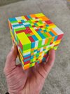


Last year, I set myself a small challenge that became more interesting than I expected. I wanted to write 揭密中文 (the Chinese title of my website Hacking Chinese) on the faces of big cubes. Not a mosaic with dozens of cubes; that would be neither interesting nor fun. One character per face.
That turned into an experiment in how Chinese characters carry information and how little of that information you actually need to read them. My goal was to write the four characters using cubes as small as possible while also making sure the text is clearly legible. But how big do the cubes need to be? YuXin sells a mass-produced 16×16, but I'm not too keen on paying $1,000 for two of them and spending dozens of hours on centre commutators.
Is 16×16 even enough to write Chinese characters? Is a lower resolution possible? What about 12×12? Or even 8×8? How small can Chinese characters be while still being legible?
Reading is much more complex than most people think. Sometimes you probably need more than 16×16 to write a character clearly, sometimes you need 2×1 pixels. 一 ("one") is pretty simple, but 𪚥 (four 龍, a super rare character meaning "the appearance of a dragon flying") needs something like 22×22 to even display all strokes.
Yet we do not read characters in isolation, so reading each stroke is neither practical nor desirable, just like in English we don't read every line in every letter and can indeed skip whole words and still understand what a sentence means.Context does much of the work. If a proficient reader sees 打喷… they will probably supply 嚏 without seeing it, forming the phrase 打喷嚏 "to sneeze". There is no other character that fits there. That matters when the grid gets tiny, as readers can interpolate and guess.
Fortunately, I'm not the only one who has thought about this, so I looked at pixel fonts for Chinese. 16×16 is very safe for ordinary text. 12×12 is still fine for a proficient reader. 8×8 sits on the edge, where context rescues the hard cases. For my goal, 中文 even squeezes into 5×5 if you are careful. 揭密 needs proper design, however.
Then the cube itself has its own constraints and idiosyncrasies. A 10×10 is not a neat 10×10 pixel grid because edge and corner pieces are larger rectangles and squares, so strokes bulge at the borders unless you plan for it. Using the corners can look really weird in some cases.
The small breakthrough for me was to stop thinking in black and white. A cube gives you at least three colours to work with, even though you could technically use more, but it would then get really tricky to keep track of which stickers are used on which face of the cube. Letting character components touch in different colours keeps the structure clear at the same resolution, which makes a big difference to legibility.
The result is 揭密中文 across a 10×10 and a 7×7, treated as a tiny bitmap in three colours. Along the way, I learnt more about reading than I expected, including where top-down processing beats bottom-up decoding and where it does not.
If you want the full write-up with more images (I have attached a few, but many of them don't make sense out of context) and a podcast episode where I talk about the project, I've included links below.
Link to the article I wrote on Hacking Chinese (also includes the podcast episode): What a big Rubik’s Cube taught me about Chinese characters


