

ducttapecuber
Premium Member
A lot of us a pretty familiar with this certificate:
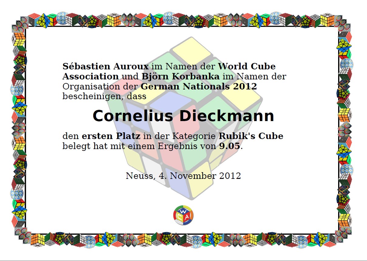 This style is fairly outdated and often is grainy and formatted incorrectly. Not to mention it still has magics on it but no skewb for example.
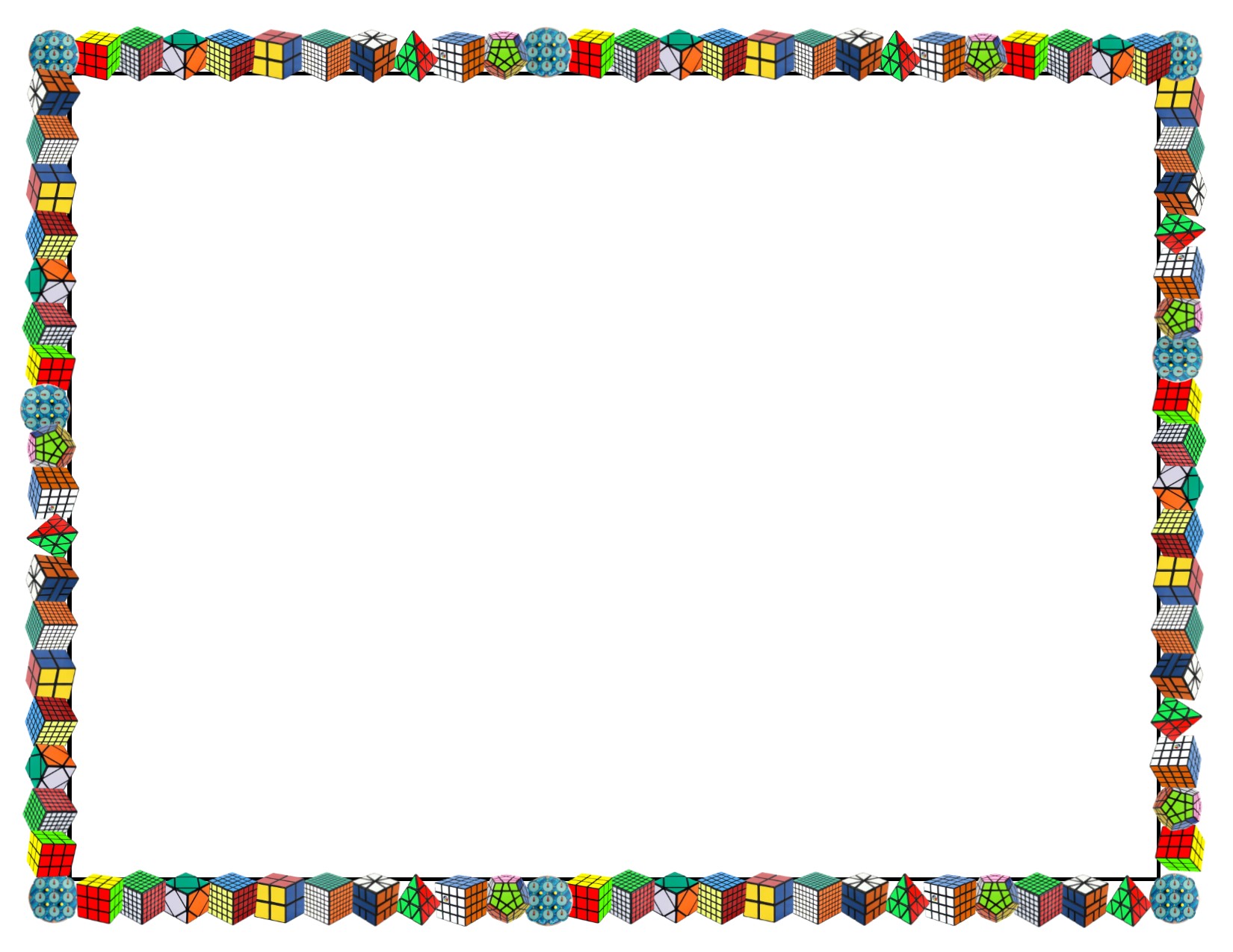
So I have revamped this design here is the new border:
 And here is an example of what a certificate would look like:
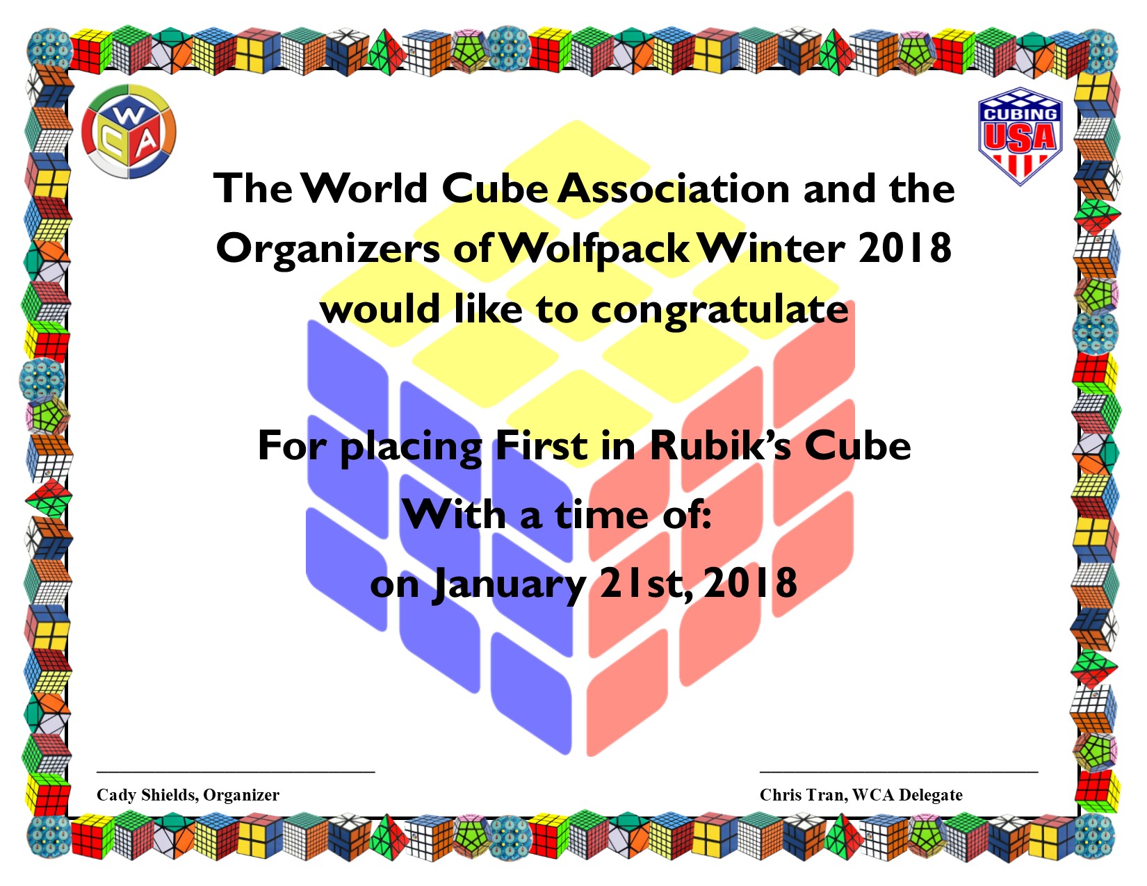 I am by no means a graphic designer, but this is what I came up with.
Thoughts? How do I improve it?
So I have revamped this design here is the new border:
Thoughts? How do I improve it?


