rowehessler
Member
- Joined
- Nov 25, 2007
- Messages
- 877
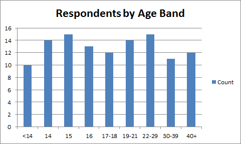
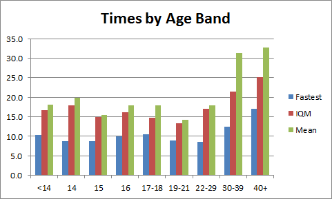
lol, according to these graphs I'm about twice as fast as the avg for my age 
lol, according to these graphs I'm about twice as fast as the avg for my age
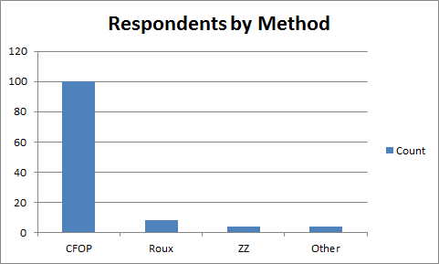
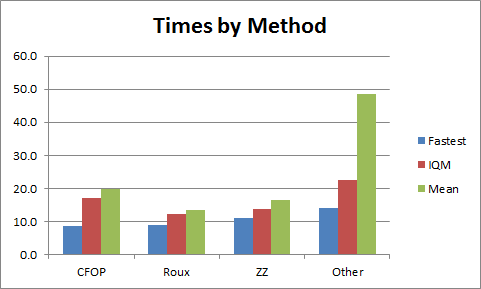

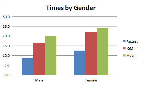
CFOPers:
Rouxists:
ZZophiles:

Nice graph.
I can see myself
And also that one guy both older and faster than me
Here's a sexy graph - a scatter chart of all times thus far (as of 0100 GMT 01/04/2014) with a polynomial trend line (order 4):
How old were you when you hit your current average?
Yeah this is really interesting. I'd be curious to see it with the sup-60 outliers removed and the vertical axis expanded, and with a quadratic trend line, or possibly just exponential. Order 4 doesn't really make sense as a trend, and just allows the 56-yo outlier to dominate the line. With a simpler trend line I suspect we will see a gradual slow down with age rather than a plateau...
Ask, and ye shall receive...I'd be curious to see it with the sup-60 outliers removed and the vertical axis expanded, and with a quadratic trend line, or possibly just exponential.

Both new trend lines show this, although the quadratic line seems to still rise artificially towards the end. In that sense, I think the exponential gives a better 'fit'.With a simpler trend line I suspect we will see a gradual slow down with age rather than a plateau...
I can do this if you wish.It would also be good to see an alternative trend line perhaps with sup-40 outliers removed (~4% of the data).
This study should be repeated every 5 or 10 years to see how the current teenagers fair in later life.
Please read the original post - this thread isn't looking for a PB average, but your GLOBAL average.AVg: 18.23 sec
Very nice! The additional detail in the Y axis makes it a lot easier to read and the new trend lines are cool. It's also helpful to see the IQM data.New chart
although the quadratic line seems to still rise artificially towards the end. In that sense, I think the exponential gives a better 'fit'.
I might revise the IQM data to remove entries for years where there are <4 respondents, allowing a smoother line and, potentially, more telling trends. Any thoughts??
I can do this if you wish.
I'm slightly torn but I think the quadratic might be more representative.
done...Perhaps you can calculate the IQM for age bands (similar to my experiments) and use those as data points (plotting the data points mid-way in the age band)?
...and done!Looking at the new graph, I think restricting it to sub-40 will be beneficial... more detail in the Y-axis. The sup-40 times don't seem to affect any of the trends.

Will check my formulae and let you know...I notice there is a bit of a spike for the 41 year olds. I think the IQM should be 33.5 and the mean 38.0. This seems to be causing a lot of the artificial final rise on the quadratic.